The short answer
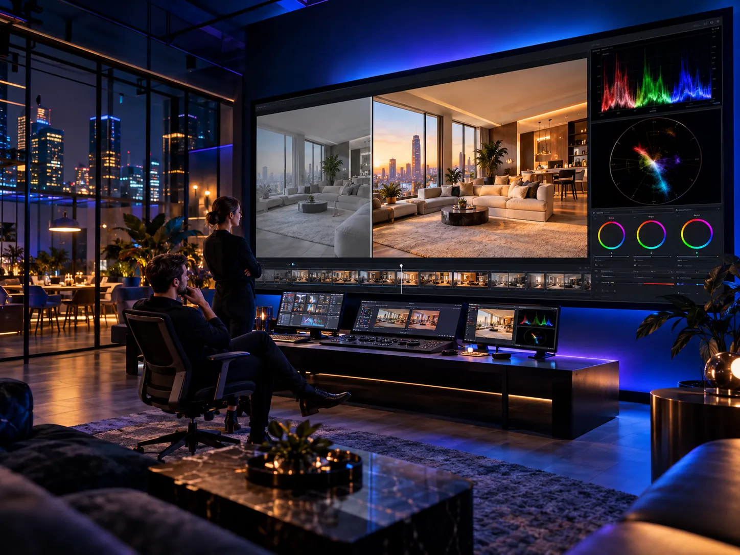
Color correction is technical. Its job is to make footage look right: accurate exposure, whites that are actually white, natural contrast and shots that match each other. Color grading is creative. Its job is to make footage look intentional: a warm or cool mood, a cinematic look, or colors that carry a brand.
Put another way, correction answers “is the image accurate?” and grading answers “what should the viewer feel?” Almost every commercial video needs both, and always in that order.
Key takeawayCorrection makes the image accurate; grading makes it expressive — and correction always comes first.
What is color correction?
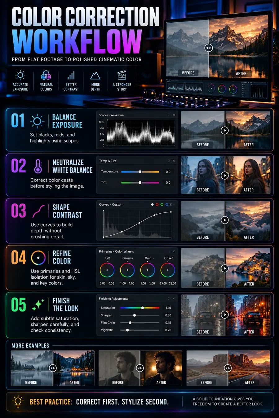
Color correction brings every shot back to a neutral, accurate starting point before any creative decision. Colorists do this on scopes rather than by eye, because monitors, room light and tired eyes all lie. The core steps:
Balance exposure
Set the darkest blacks and brightest highlights on the waveform, then place the midtones between them, so skies aren’t clipped and shadow detail doesn’t disappear.
Neutralize white balance
Remove the cast the lighting left behind: green from fluorescents, orange from tungsten, blue from daylight shade. The vectorscope shows any tint at a glance.
Shape contrast
Flat footage looks hazy. A gentle curve adds depth without crushing shadows or blowing out highlights.
Match shots
Two cameras, a phone plus a cinema camera, or a shoot that ran from noon to golden hour all make color jump at every cut. Matching makes those differences invisible.
Key takeawayCorrection means exposure, white balance, contrast and matching — measured on scopes, not guessed.
What is color grading?
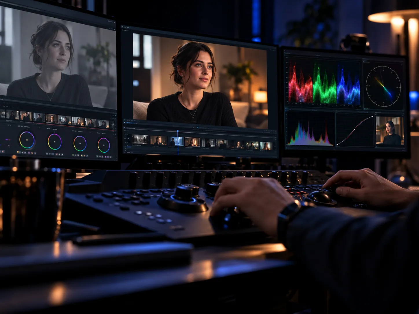
Once shots are accurate and consistent, grading gives the video its personality. That might be a warm, inviting look for a restaurant, a clean and cool palette for a SaaS brand, or a cinematic split of teal shadows and warm highlights.
Secondary grading
Adjusting one part of the image without touching the rest: deepening a sky, making a product color pop, or protecting skin tones from the scene’s look. These tools — HSL qualifiers, power windows and tracking — are what separate a professional grade from a preset.
LUTs
A LUT (usually a .cube file) stores a color transform you can apply to other footage. It’s great for keeping a brand look consistent, but it assumes the footage starts from a known, corrected state — so it isn’t a substitute for correction.
Key takeawayGrading is a creative decision that serves the story and the brand, built on corrected footage.
Side-by-side comparison
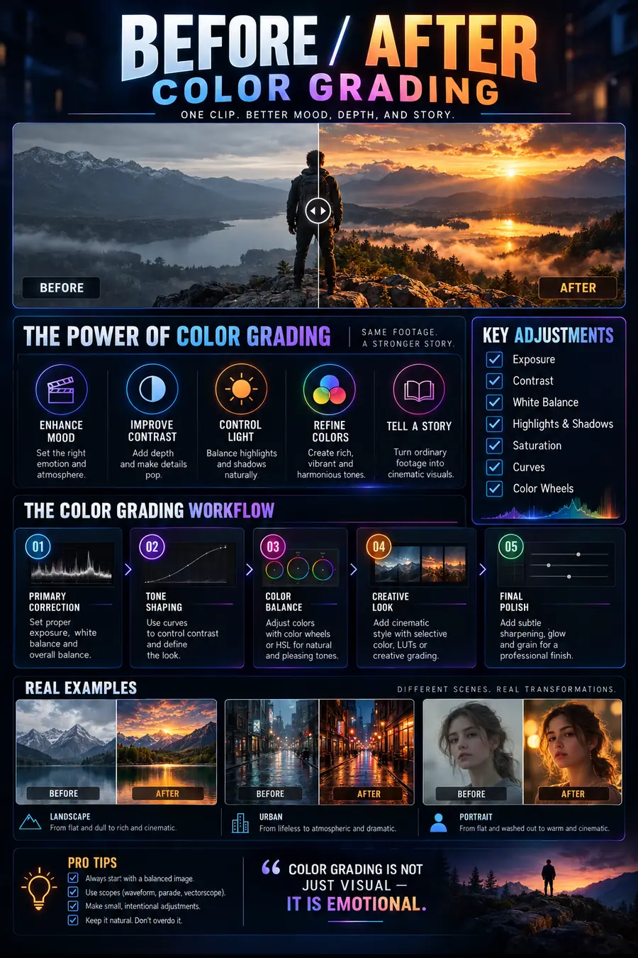
Here is how the two steps differ in practice:
| Color correction | Color grading | |
|---|---|---|
| Goal | Accurate, natural image | Intentional mood and look |
| When | First | After correction |
| Main tools | Scopes, primary wheels, curves | Secondaries, masks, LUTs, grain, vignette |
| The question | Is it right? | How should it feel? |
| Result | Matched shots with no color casts | A consistent visual identity |
Key takeawaySometimes the same tools, but two different goals and a fixed order.
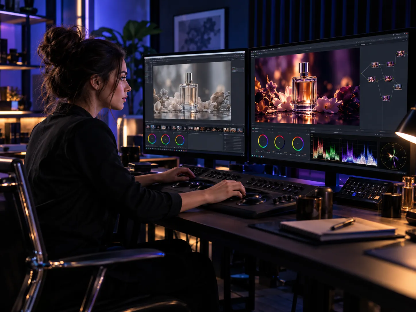
Why correction always comes before grading
Picture adding a warm look to a shot that already has an orange cast from bad white balance. Faces go neon orange, and every attempt to rescue them breaks the look. Starting from a neutral shot means any look you add lands exactly as intended — and lands the same way on every shot.
That’s why professional grading follows the same sequence: balance exposure, neutralize white balance, shape contrast, refine color with primaries and secondaries, then finish with measured saturation, grain and vignette and a final consistency pass.
Key takeawayBest practice: correct first, stylize second.
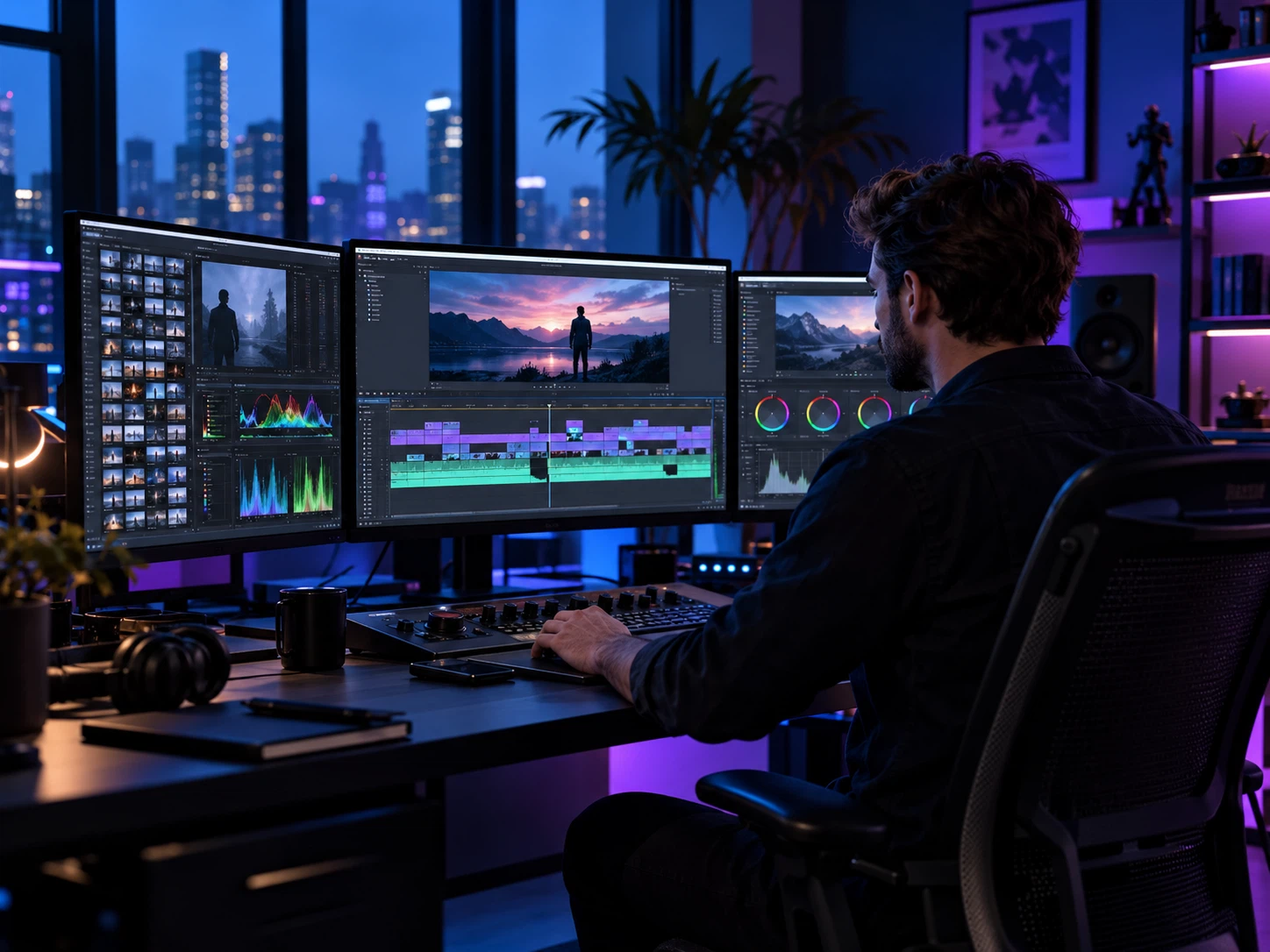
LOG and RAW footage: why it looks so flat
Many cameras — and some recent phones — can record in a LOG profile that protects as much highlight and shadow detail as possible. The result looks gray, low-contrast and desaturated straight off the card. It isn’t a mistake; it’s raw material.
LOG footage first needs a transform from the camera’s color space (S-Log, V-Log, C-Log and so on) to a display space such as Rec.709, then correction and grading. RAW gives you even more room to adjust exposure and white balance after the fact. Either way, less compression (10-bit, for example) means the footage holds up to bigger adjustments without banding or noise.
Key takeawayLOG isn’t a shooting error — it’s a flat source designed to be transformed and graded.
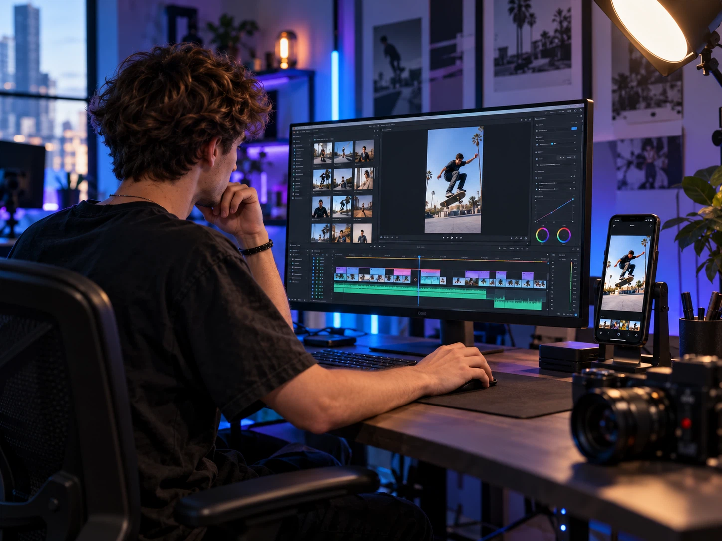
What software do colorists use?
There is no single “right” tool. These are the ones you’ll hear about most:
- DaVinci Resolve (Blackmagic Design): the best-known grading application, with node-based grading, precise scopes and color management; available in a free version and a paid Studio version.
- Adobe Premiere Pro: the Lumetri Color panel handles basic correction, curves, color wheels and LUTs, and works well when the edit stays in Premiere.
- Final Cut Pro (Apple): color wheels, curves, LUT support and HDR workflows on the Mac.
- Adobe After Effects: for grading VFX and motion shots inside a composite rather than full-program grading.
- Baselight (FilmLight): a high-end system found in film and TV post-production facilities.
Key takeawayThe tool matters less than the order of operations, the scopes and the source footage.
Common mistakes that make footage look cheap
We see these again and again in projects that come in for a regrade:
- Dropping a LUT or preset straight onto uncorrected footage.
- Oversaturating until skin turns orange and skies turn electric blue.
- Skipping shot matching, so color jumps from cut to cut.
- Grading on an uncalibrated monitor in a bright room.
- Sending compressed exports instead of camera originals.
- Crushing every shadow in the name of a “cinematic” look.
Key takeawayMost grading problems come from skipping correction or overdoing the look.
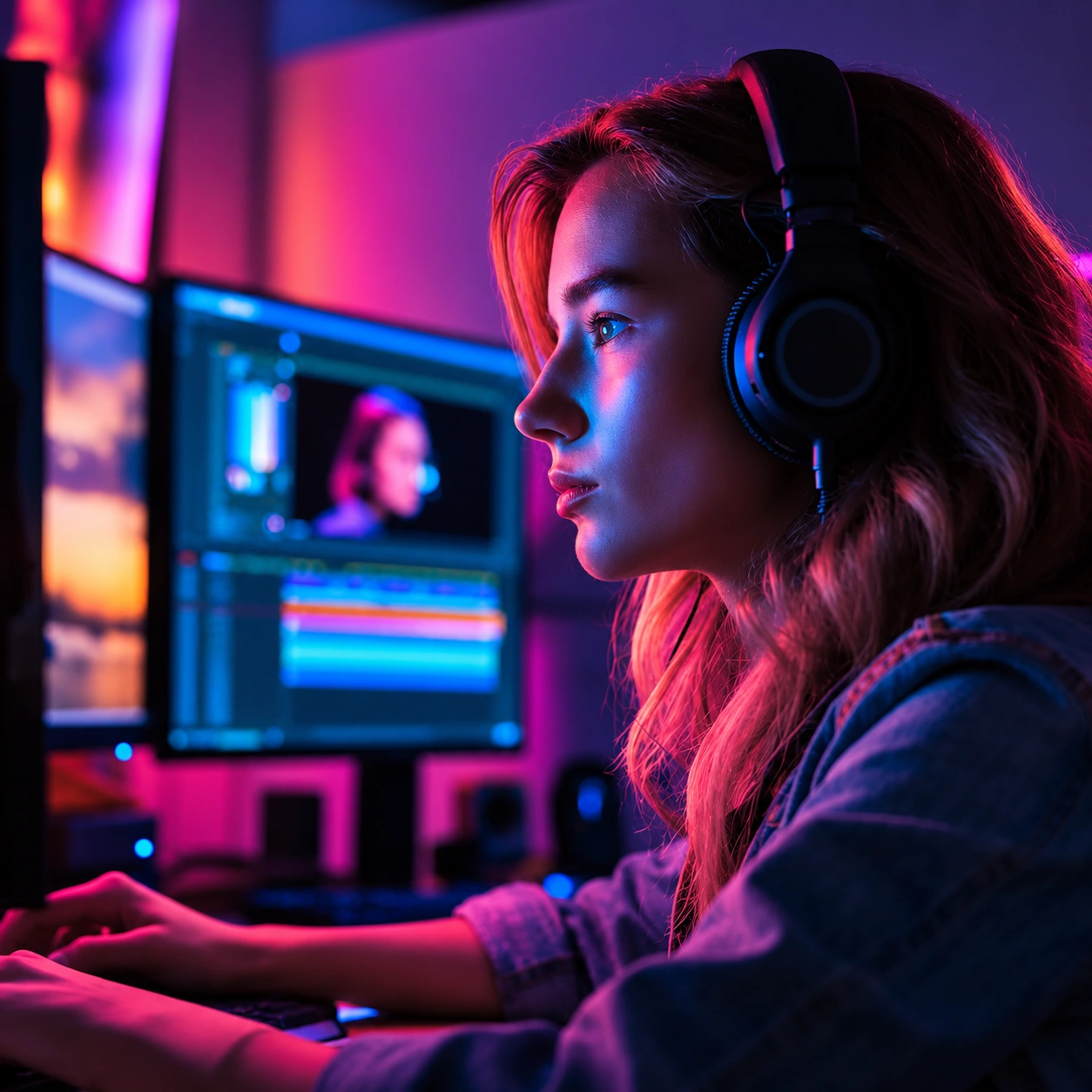
Skin tones: the hardest test of any grade
Viewers forgive a sky that’s a little too blue, but they notice a face that leans green or orange immediately. That’s why colorists treat skin separately: on the vectorscope, healthy skin across the full range of complexions falls near a single line often called the skin tone line.
During correction we bring skin back toward that line once the lighting cast is removed. During grading we isolate it with a qualifier so the scene’s look doesn’t drag it along — shadows can go teal and the sky can go amber while faces stay natural. That restraint is what makes a commercial feel premium instead of filtered.
Key takeawaySkin is protected with secondary grading so it stays natural whatever the look.
When to bring in a professional colorist
If the video represents your brand, runs as a paid ad, or was shot on multiple cameras or in LOG, a professional grade makes a visible difference in how viewers perceive it. See our color grading services and packages, or read how much color grading costs to see what drives the price.
If you need the edit as well, our video editing services include basic color correction that can be upgraded to a full grade.
Key takeawayBrand, ad and multi-camera or LOG projects are worth a professional grade.